LoGos
Tools: Figma, iArtBBook, Canva
I went with a simple calligraphy font, but because calligraphy can also take up a lot of space, I only used two letters, those being the initials. Either gold or yellow was surely a primary color to give off the elegant, "high end" or luxury feel. This is why the actual logo needed to be very simple (less is more)

This design needed to come off dainty but still with floral touch, which could kind of be a challenge, but that is what makes the design unique. You don't expect to see, nor does one often encounter naturally a bouquet of golden roses. This allows for a very bland but textured background.


This design in particular, I wanted to seek more of a challenge by adding a little color, but not too much as the client stated. The colors here are also generally just in the bouquet, which only aligns the top edge so it doesn't overcrowd the card. There is also touch of Gold here to give the "heavenly" feel.
This design incorporated the smaller details I used from the previous designs. This design accentuates with the gold, while still maintaining that simplistic flair. As stated, details here were very important, and the way the Gold corners the bottom right and has a slight effect on the black really hit the mark for this design. There is also dainty greenery on both sides that add to the idea of floristry while still being very subtle.
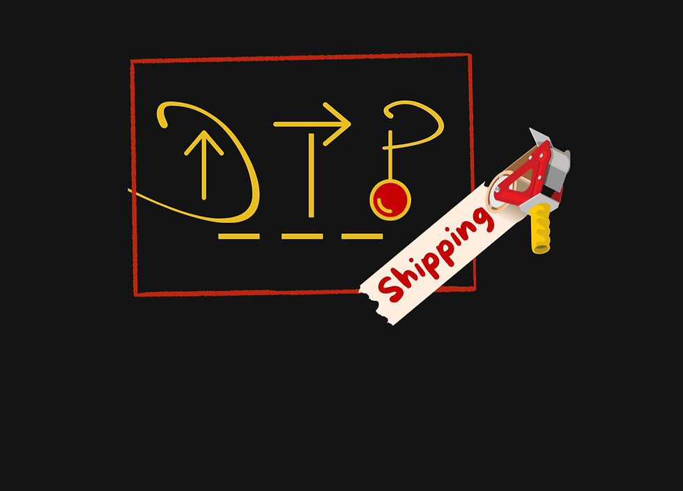
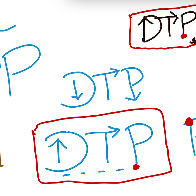
Here, the Final design includes the colors of red and yellow because when considering both a black white or even gray trucks, these colors would still be very bold. As you can see, with the simplicity of the arrows, I was allowed to add a few details such as the roll of tape and the location pin, without overcrowding the logo.


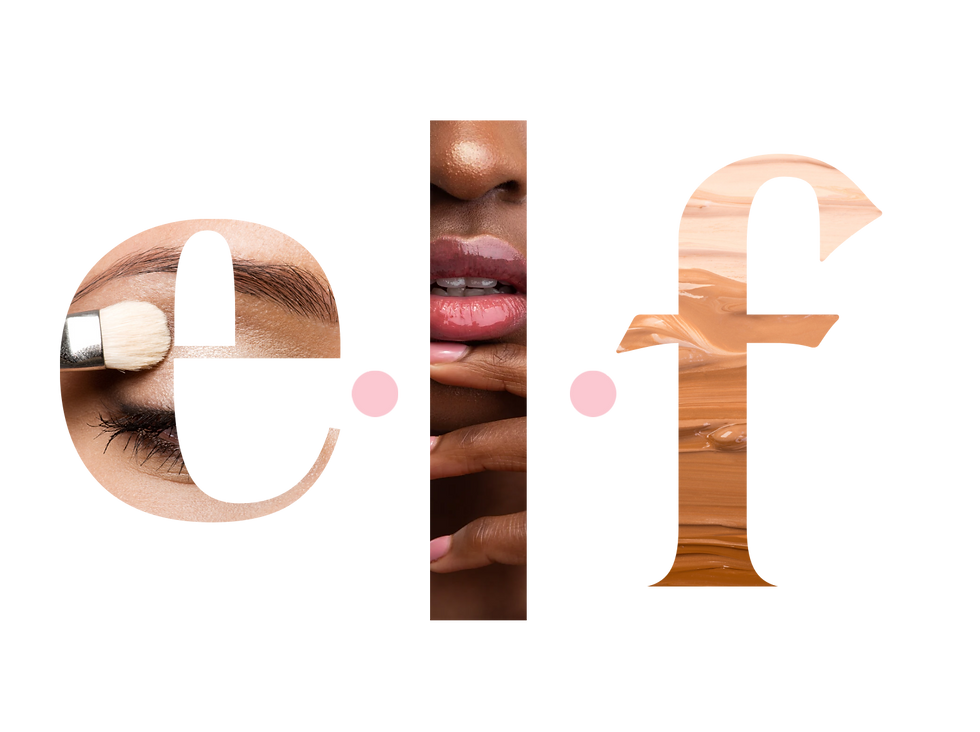
For these designs I wanted to bring back the original typography of the lower case simplistic font accompanied by the periods. I thought here it would be best to magnify and use a photo fill that would represent each letter of the acronym pretty clearly. The one on the left is a more vibrant approach, while the one on the right is focusing more on the shades and range of the product depicting more of an emotional connection.
This is where I made the decision on the 3 main colors: red, pink and brown. These are naturally the essential colors that one would think about when mentioning eyeshadow, lipstick, and foundation. Of course I also cleaned the design up by using different shapes and letters to bring this logo to life.
This approach was a softer and more precise representation. This design gives a new look but also maintains the colors Black and White as major parts of this color scheme as well. The goal still being inclusivity, this logo is still a 3 n1
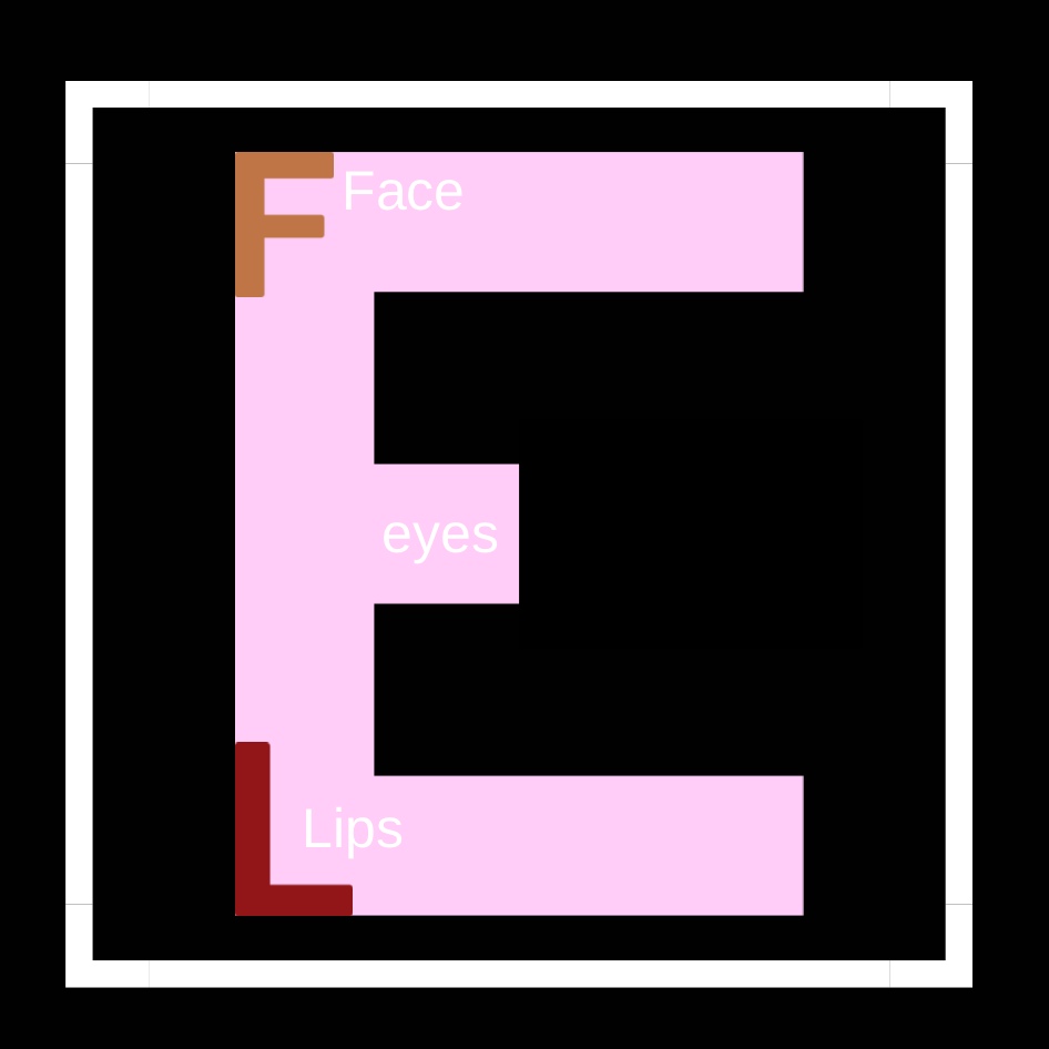
This prompt was originally for the redesigning of a makeup brand and I thought it seemed fitting to redesign the logo as well. My design process began with the color scheme in mind, ELF also known as eyes, lips, and face is the main focus of the new design.


The idea here was to design a logo that uses all of the letters to create a bigger picture that contained hidden letters. The color scheme was inspired from their current theme, using pink of course. The black incorporation is from the inspiration of the moon giving the logo a more mysterious effect. Being that the name is the Moon with two O's, this was a great place to start. Going this route there is n extra circle, but also adds to the personality and design. I wanted the typography here to be similar to that of the company as well with the long slim lettering.
There is a different approach here as the circles are more circular to depict more of the moon essence. There is also interlocking circles in the middle, still an incorporation of their original design while also giving the customers that sense of familiarity


Originally, I had the idea to use the word Canine as a part of the logo design. Being that I was also going for a playful and detailed theme, this idea quicky became very crowded. I made the decision to only keep the 2 Cs, and be creative with that base. The color scheme here was inspired first by greenery. This being an app for Dog Parks, the incorporation of the outside vibrancy should be added with a bold contrasting color such as orange.
Here I started with the base of the two cs and thought to build from there staying as simple as I could. The paws were easily incorporated since I toned the based down, more distinct details could be added.
Key Words:
Unique but Recognizable
Seen when printed on trucks
The idea here was to use simple shapes and typography such as arrows because it would allow for more detail. It also gives an indication of direction or travel. I then decided upon the color scheme, which was originally blue and red so it could be seemingly distinctive.
Key Words:
Floral but professional
Not overly colorful
High End
Color Scheme: Gold and White or Light Pink and blue